A major challenge in science writing is how to effectively communicate real, scientific uncertainty. Sometimes we just don't know have enough information to make accurate predictions. This is particularly problematic in the case of rare events in which the potential range of outcomes is highly variable. Two topics that are close to my heart come to mind immediately as examples of this problem: (1) understanding the consequences of global warming and (2) predicting the outcome of the emerging A(H1N1) "swine flu" influenza-A virus.
Harvard economist Martin Weitzman has written about the economics of catastrophic climate change (something I have discussed before). When you want to calculate the expected cost or benefit of some fundamentally uncertain event, you basically take the probabilities of the different outcomes and multiply them by the utilities (or disutilities) and then sum them. This gives you the expected value across your range of uncertainty. Weitzman has noted that we have a profound amount of structural uncertainty (i.e., there is little we can do to become more certain on some of the central issues) regarding climate change. He argues that this creates "fat-tailed" distributions of the climatic outcomes (i.e., the disutilities in question). That is, the probability of extreme outcomes (read: end of the world as we know it) has a probability that, while it's low, isn't as low as might make us comfortable.
A very similar set of circumstances besets predicting the severity of the current outbreak of swine flu. There is a distribution of possible outcomes. Some have high probability; some have low. Some are really bad; some less so. When we plan public health and other logistical responses we need to be prepared for the extreme events that are still not impossibly unlikely.
So we have some range of outcomes (e.g., the number of degrees C that the planet warms in the next 100 years or the number of people who become infected with swine flu in the next year) and we have a measure of probability associated with each possible value in this range. Some outcomes are more likely and some are less. Rare events are, by definition, unlikely but they are not impossible. In fact, given enough time, most rare events are inevitable. From a predictive standpoint, the problem with rare events is that they're, well, rare. Since you don't see rare events very often, it's hard to say with any certainty how likely they actually are. It is this uncertainty that fattens up the tails of our probability distributions. Say there are two rare events. One has a probability of  and the other has a probability of
  . The latter is certainly much more rare than the former. You are nonetheless very, very unlikely to ever witness either event so how can you make any judgement that the one is a 1000 times more likely than the other?
Say we have a variable that is normally distributed. This is the canonical and ubiquitous bell-shaped distribution that arises when many independent factors contribute to the outcome. It's not necessarily the best distribution to model the type of outcomes we are interested in but it has the tremendous advantage of familiarity. The normal distribution has two parameters: the mean ( ) and the standard deviation (
 ). If we know and exactly, then we know lots of things about the value of the next observation. For instance, we know that the most likely value is actually and we can be 95% certain that the value will fall between about -1.96 and 1.96.
Of course, in real scientific applications we almost never know the parameters of a distribution with certainty. What happens to our prediction when we are uncertain about the parameters? Given some set of data that we have collected (call it  ) and from which we can estimate our two normal parameters and , we want to predict the value of some as-yet observed data (which we call
  ). We can predict the value of using a device known as the posterior predictive distribution. Essentially, we average our best estimates across all the uncertainty that we have in our data. We can write this as

OK, what does that mean?  is the probability of the data, given the values of the two parameters. This is known as the likelihood of the data.
  is the probability of the two parameters given the observed data. The two integrals mean that we are averaging the product
 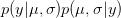 across the range of uncertainty in our two parameters (in statistical parlance, "integrating" simply means averaging).
If you've hummed your way through these last couple paragraphs, no worries. What really matters are the consequences of this averaging.
When we do this for a normal distribution with unknown standard deviation, it turns out that we get a t-distribution. t-distributions are characterized by "fat tails." This doesn't mean they look like this. What it means is that the probabilities of unlikely events aren't as unlikely as we might be comfortable with. The probability in the tail(s) of the distribution approach zero more slowly than an exponential decay. This means that there is non-zero probability on very extreme events. Here I plot a standard normal distribution in the solid line and a t-distribution with 2 (dashed) and 20 (dotted) degrees of freedom.

We can see that the dashed and dotted curves have much higher probabilities at the extreme values. Remember that 95% of the normal observations will be between -1.96 and 1.96, whereas the dashed line is still pretty high for outcome values beyond 4. In fact, for the dashed curve, 95% of the values fall between -4.3 and 4.3. In all fairness, this is a pretty uncertain distribution, but you can see the same thing with the dotted line (where the 95% internal interval is plus/minus 2.09). Unfortunately, when we are faced with the types of structural uncertainty we have in events of interest like the outcome of global climate change or an emerging epidemic, our predictive distributions are going to be more like the very fat-tailed distribution represented by the dashed line.
As scientists with an interest in policy, how do we communicate this type of uncertainty? It is a very difficult question. The good news about the current outbreak of swine flu is that it seems to be fizzling in the northern hemisphere. Despite the rapid spread of the novel flu strain, sustained person-to-person transmission is not occurring in most parts of the northern hemisphere. This is not surprising since we are already past flu season. However, as I wrote yesterday, it seems well within the realm of possibility that the southern hemisphere will be slammed by this flu during the austral winter and that it will come right back here in the north with the start of our own flu season next winter. What I worry about is that all the hype followed by a modest outbreak in the short-term will cause people to become inured to public health warnings and predictions of potentially dire outcomes. I don't suppose that it will occur to people that the public health measures undertaken to control this current outbreak actually worked (fingers crossed). I think this might be a slightly different issue in the communication of science but it is clearly tied up in this fundamental problem of how to communicate uncertainty. Lots to think about, but maybe I should get back to actually analyzing the volumes of data we have gathered from our survey!